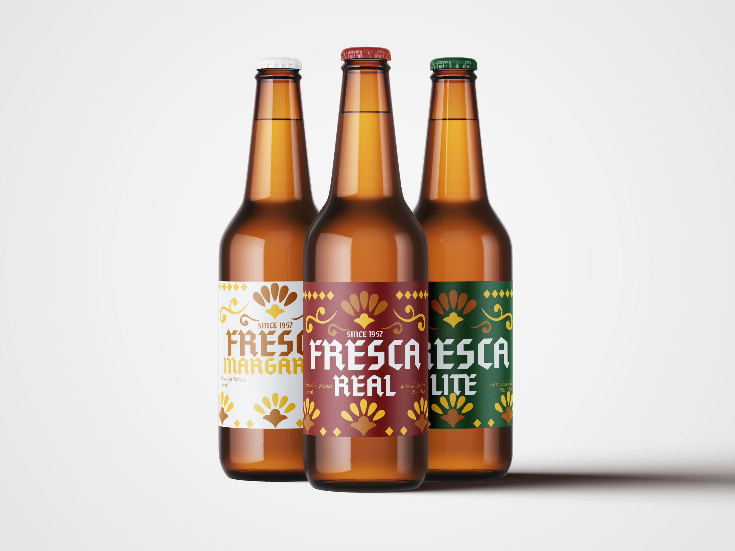
FRESCA
FRIENDS, FAMILY, & FIESTA!
Fresca Real is more than a beer—it’s a celebration of Mexican tradition, family, and craftsmanship. Rooted in heritage, its visual identity draws inspiration from classical Mexican design, blending nostalgia with authenticity. The bold, geometric typography reflects strength and pride, while the ornamental flourishes and warm color palette pay homage to traditional Mexican tiles and decorative motifs. The crest-like emblem, with its rich golden hues and intricate details, symbolizes legacy and excellence, making Fresca Real a true reflection of timeless artistry.
SCOPE
Heritage
Tradition
Craftsmanship
Authenticit
The concept was straightforward—infuse a traditional Mexican pattern with a familiar, warm color palette to create a sense of heritage. To balance this cultural inspiration, I opted for a clean and modern typography, introducing a striking contrast that bridges the past and present.

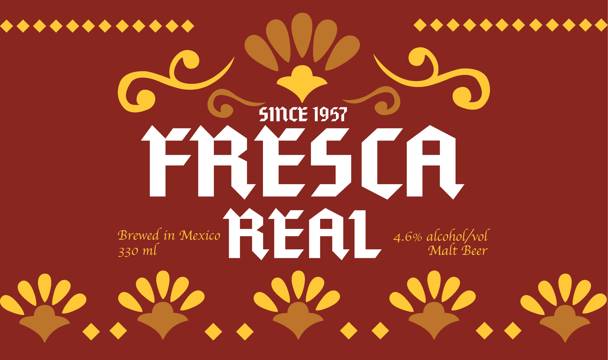
Color Selection: Defining Identity Through Contrast
With the packaging foundation set, the focus shifted to a cohesive brand identity. Red was chosen as the primary color for its bold contrast with the yellow pattern, while green and white distinguished product variations without disrupting harmony. To maintain consistency, the main adjustment was in the color palette. A challenge with the title’s fit was resolved by slightly reducing the font size, ensuring clarity and balance across the design.