OMAHA FC
A TEAM FOR THE CITY!
Welcome to our thrilling project, where we bring Omaha’s passion for sports to life with a bold new MLS team identity! This isn’t just about designing a logo—it’s about capturing the heart of Omaha and uniting fans under one powerful brand.
Inspired by the city's rich history, vibrant community, and unwavering spirit, our design takes key elements that define Omaha and transforms them into a team identity that every local can proudly support. From the crest to the uniforms and beyond, we’re creating a club that embodies strength, unity, and the love of the game.
SCOPE
Identity
Unity
Passion
Legacy

CREST
ICON


COLORS
Inspired by the Omaha City's flag, the Omegas acquire its colors: red, white, & black.
SHAPE
The city's architecture gave shape to our crest, by imitate the Fist National Bank Tower.
NAME
The word Omega means "the great O" a phrase that matches the city's name
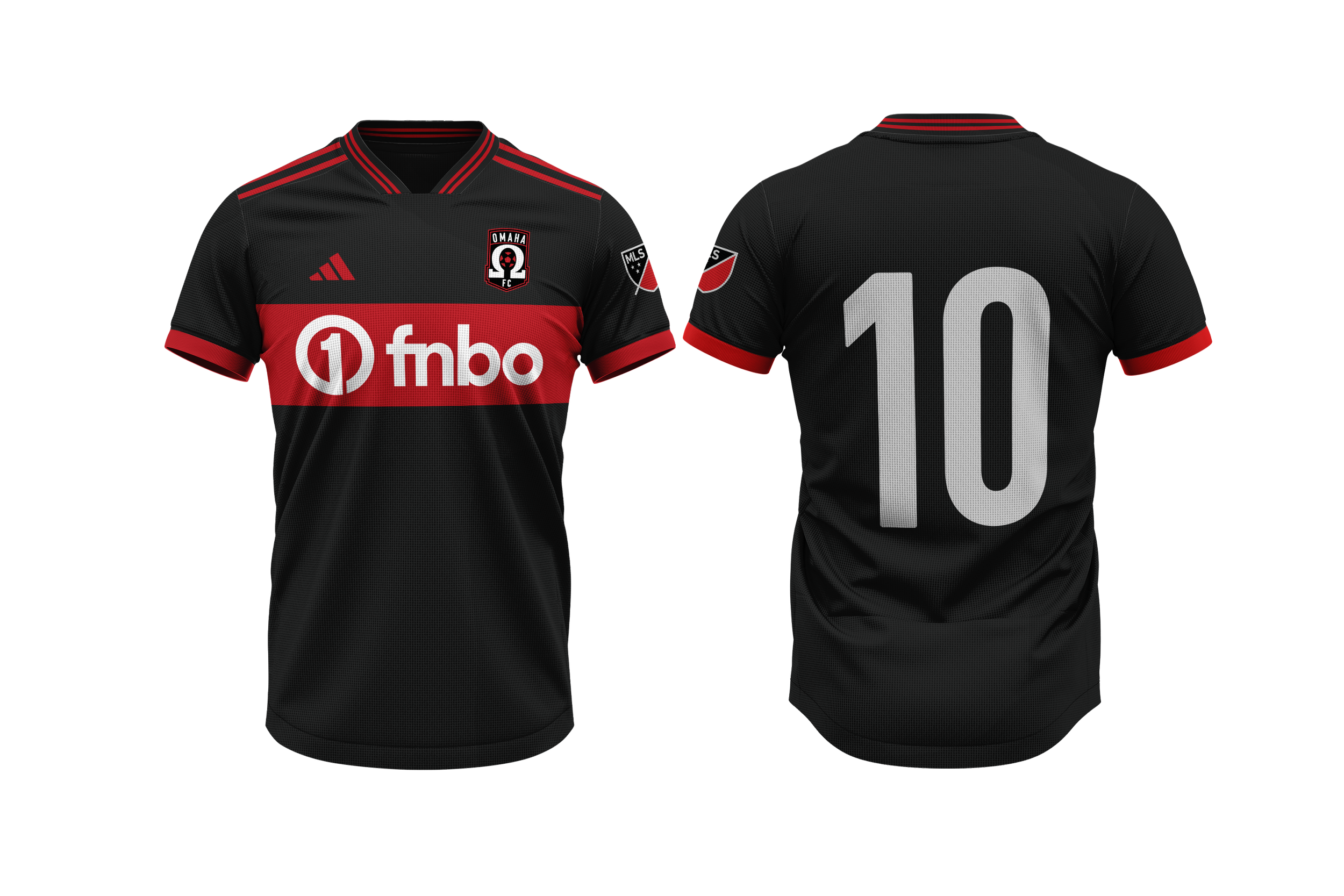
HOME KIT

AWAY KIT


