PURE PROTEIN
A TEAM FOR THE CITY!
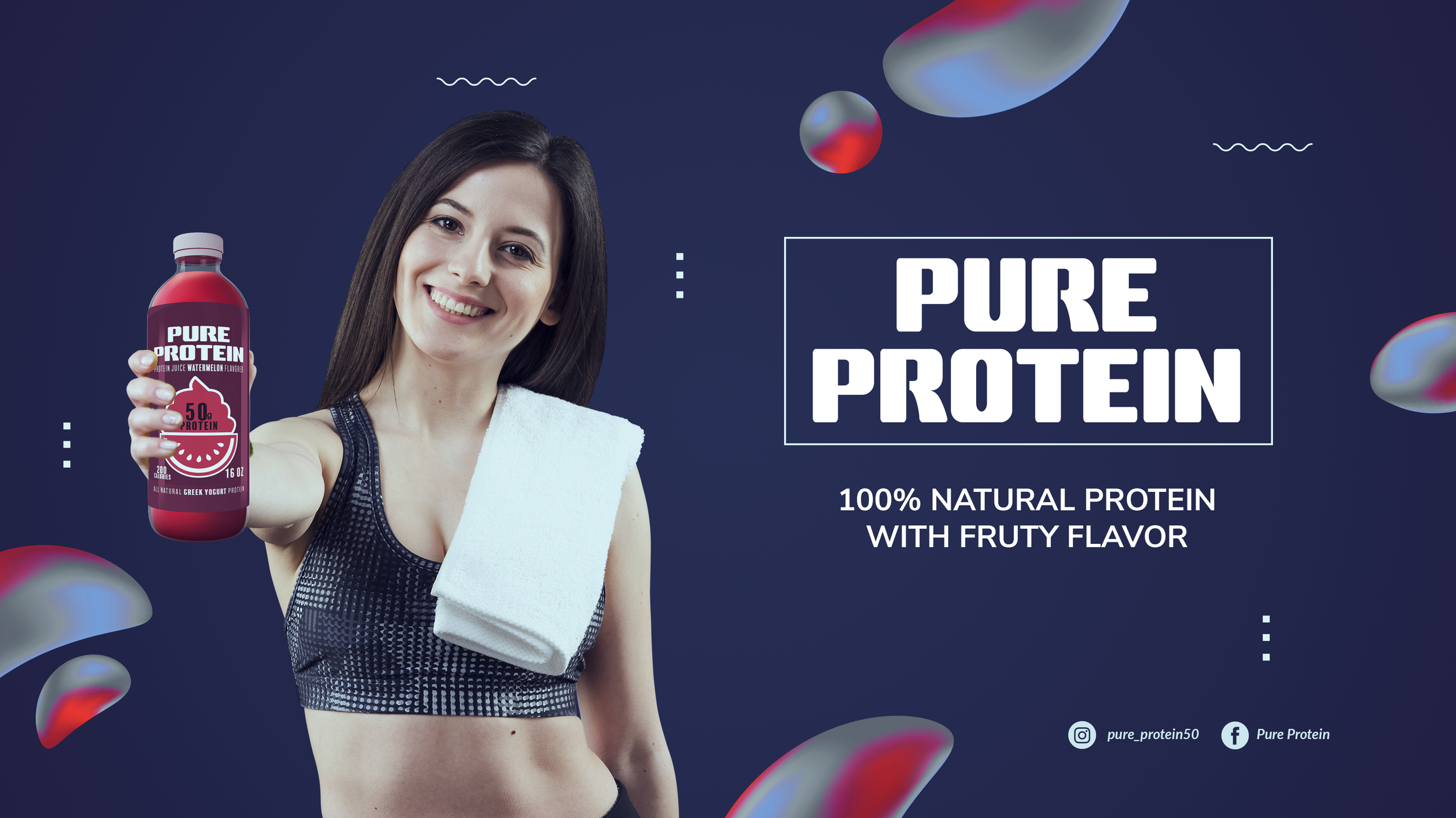
Designed with fitness enthusiasts and health-conscious individuals in mind.This project centered on building a bold identity for Pure Protein, a brand focused on all-natural, high-protein juice drinks. The logo was developed from a series of hand-drawn sketches, selecting the strongest concept to refine digitally. Clean lines, strong shapes, and visual clarity were prioritized to express vitality and trustworthiness. Once the logo reached a polished stage, the focus shifted to packaging design. Each flavor variation features a vibrant, custom illustration that blends a protein source with a fruit element, paired with a color palette that communicates freshness, strength, and a modern health-focused appeal.
SCOPE
Branding
Packaging
Illustration
Wellness

For this project, the goal was to create a product concept within the rapidly growing health and fitness industry—protein shakes. The design focuses on modernity and simplicity, reimagining the product as a line of refreshing protein juices. Each flavor features a distinct source of protein, represented not only through iconography but also through a carefully selected color palette. The result is a bold, eye-catching packaging design that communicates nutritional value and fits seamlessly into a healthy lifestyle.
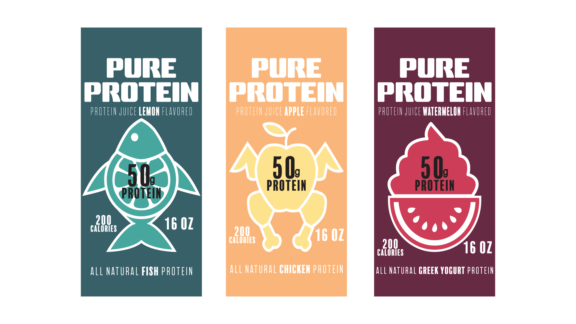
Once the brand identity was established, the next step was choosing the appropriate container for the juices. While cans were initially considered, plastic bottles were ultimately selected to better align with the product’s healthy and transparent image. The clear packaging allows the consumer to see the juice itself, reinforcing a sense of honesty and freshness that supports the overall brand concept.