EXPRESS CAT
Transforming a Symbol into Identity
The challenge was to take two random words—“Jumping” and “Cat”—and build a compelling brand from them. This process began with crafting a strong visual identity, ensuring that the chosen symbol effectively conveyed the essence of a packaging transportation company. Beyond logo creation, the project required developing supporting materials that showcased the brand in action, reinforcing its identity across different applications. Additionally, refinements were made based on feedback to enhance clarity, cohesion, and overall impact, ensuring that the final design not only met but exceeded expectations.
SCOPE
Identity
Adaptability
Clarity
Refinement
Creative Process: From Concept to Final Identity
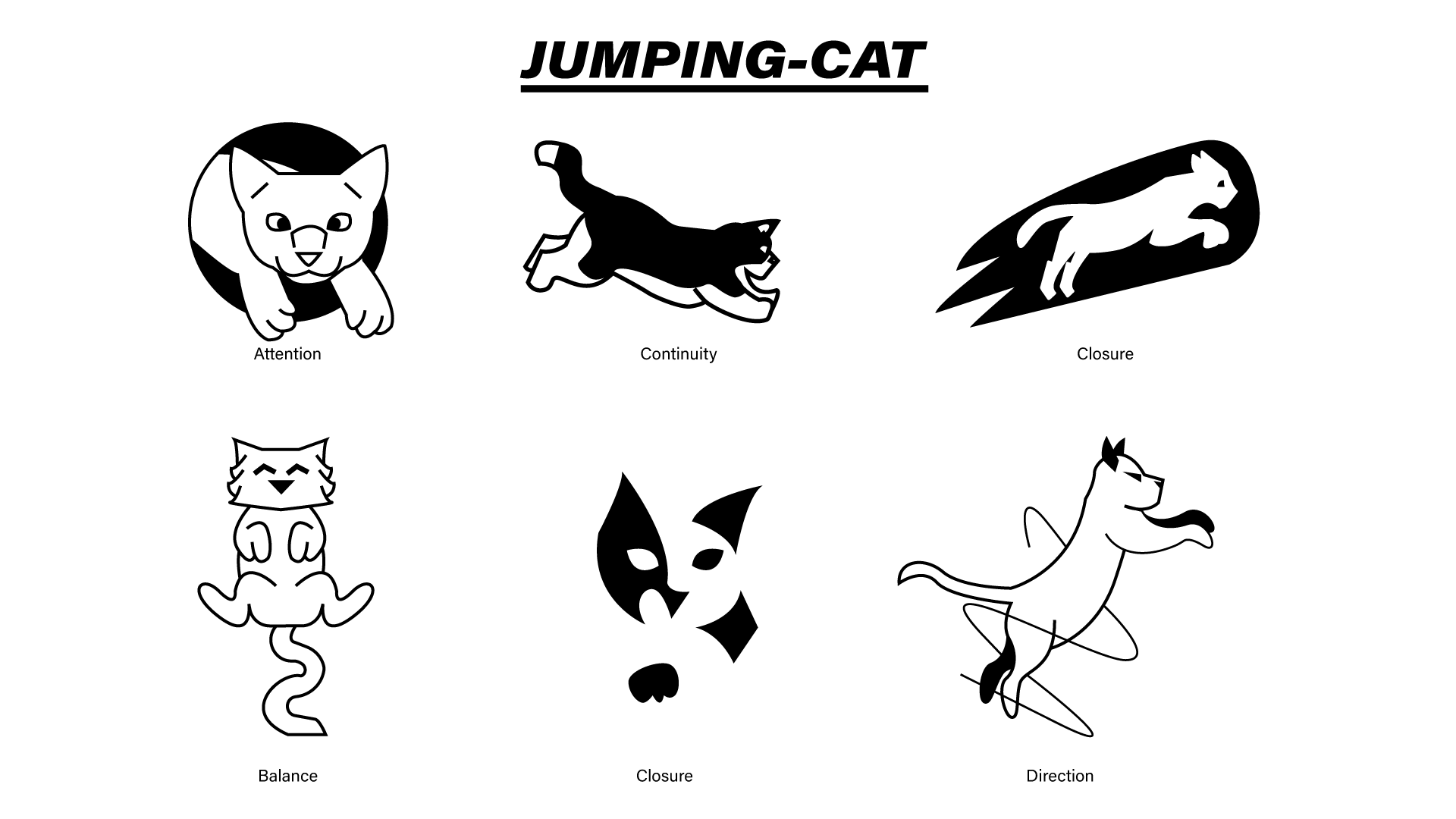
Every project begins with an unexpected challenge, and this one was no different. Given the phrase “Jumping Cat,” I explored 12 initial concepts before refining them into a single, strong identity suited for a packaging transportation company. The selected logo captured the essence of movement and reliability, aligning with the brand’s purpose. While the design was already solid, further refinements were necessary to ensure its adaptability and longevity, making it a future-proof visual identity.


Refining the: Color, Typography, and Cohesion
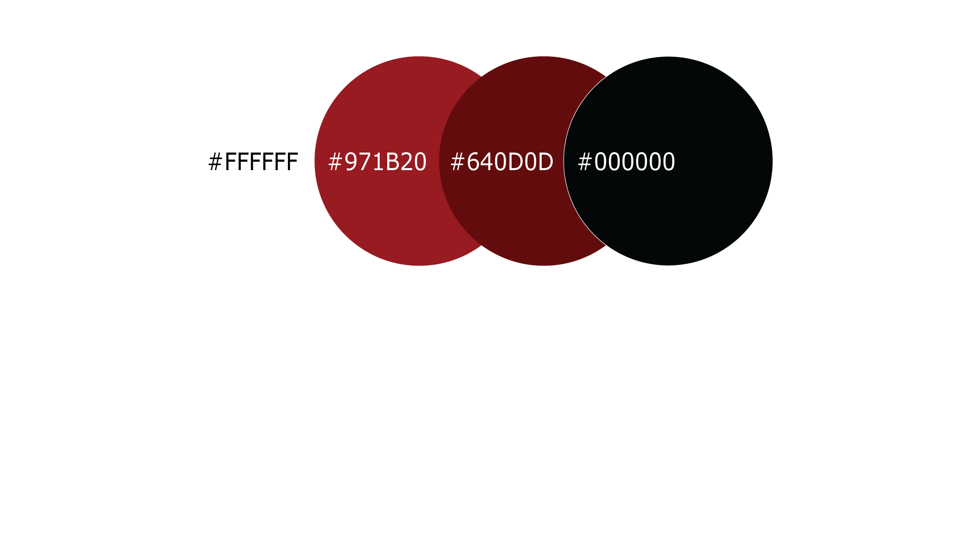
With the logo polished, the next step was selecting the right font and color to reinforce the brand’s identity. To ensure distinction, I analyzed the primary colors used by other packaging delivery companies, ultimately choosing a muted red—bold enough to stand out yet refined enough to avoid a playful look. The chosen typography conveys speed and professionalism, aligning with the brand’s dynamic nature. With these elements in place, the final task was to compile them into a comprehensive brand book, ensuring consistency and clarity across all applications.


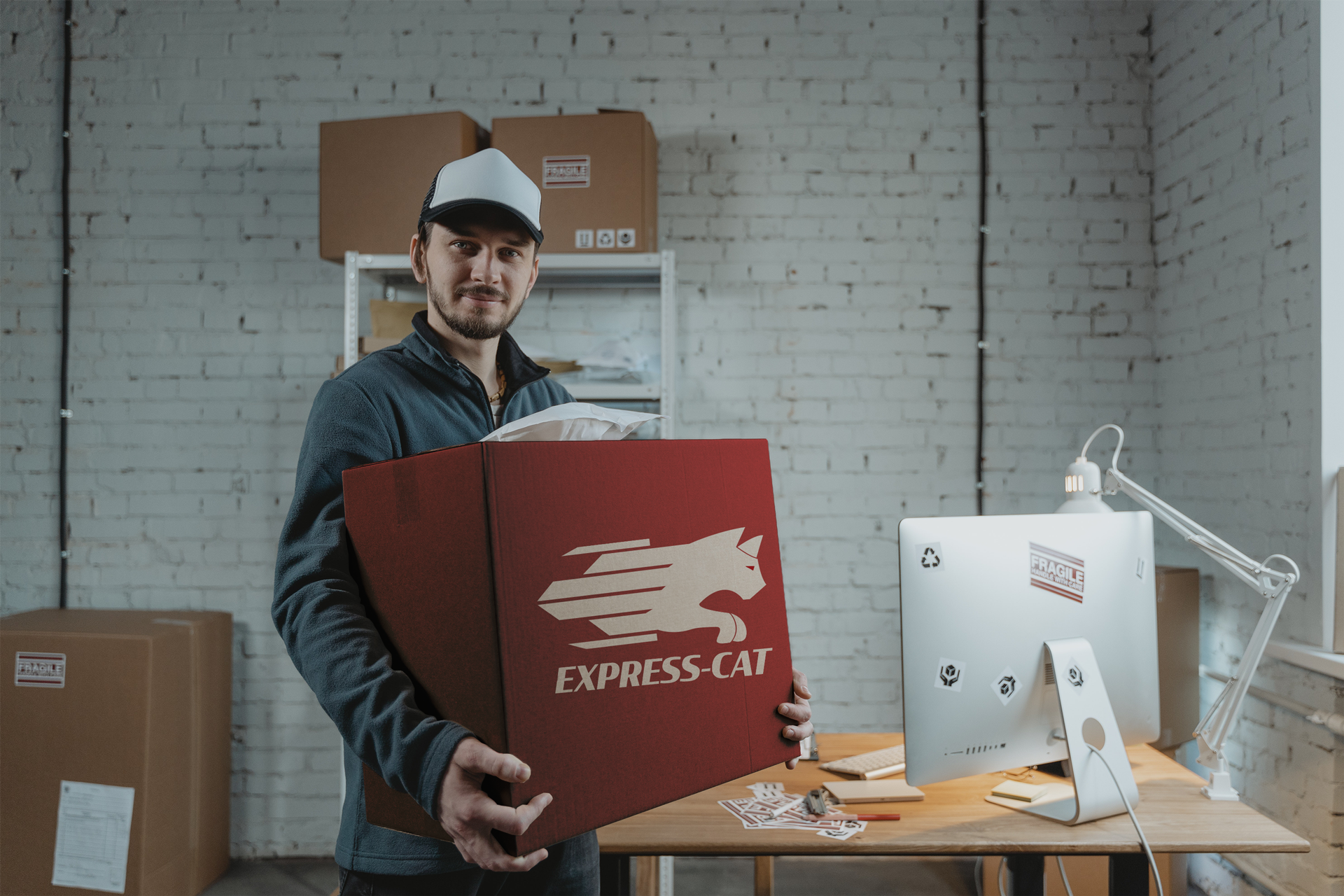
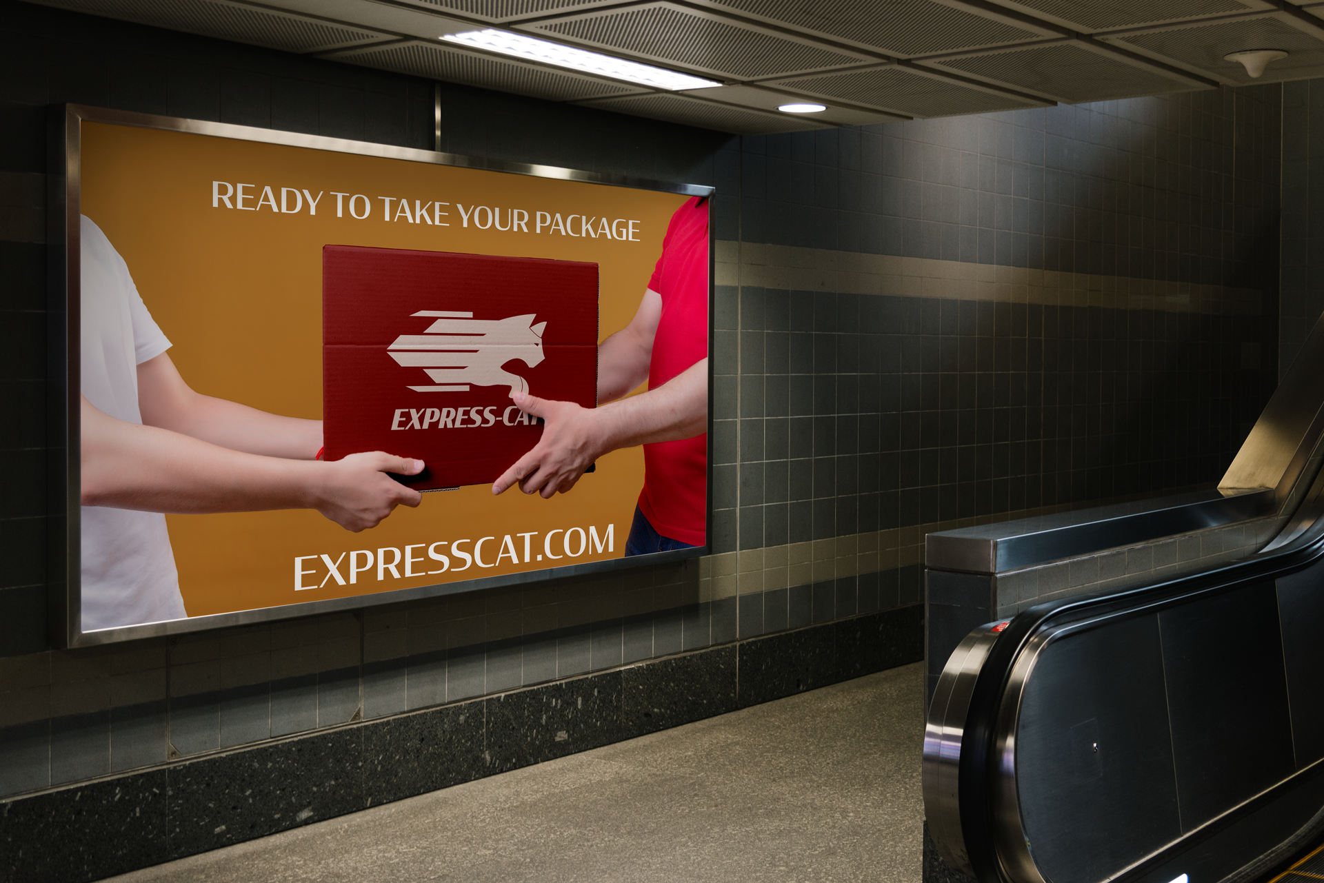
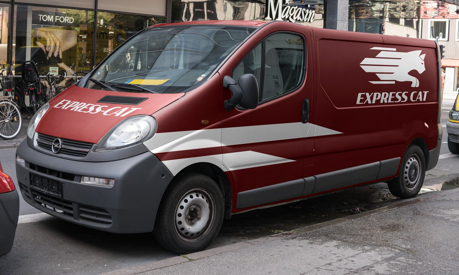
Bringing the Brand to Life: Practical Applications
With a solid identity established, the next step was applying it to real-world objects. Even at this stage, maintaining the essence of packaging remained a priority. The cardboard texture of the boxes became a key design element, seamlessly carried over to business cards to reinforce the brand’s connection to its industry. This thoughtful integration ensured a cohesive and tactile brand experience, strengthening its visual and functional identity.