FRESCA
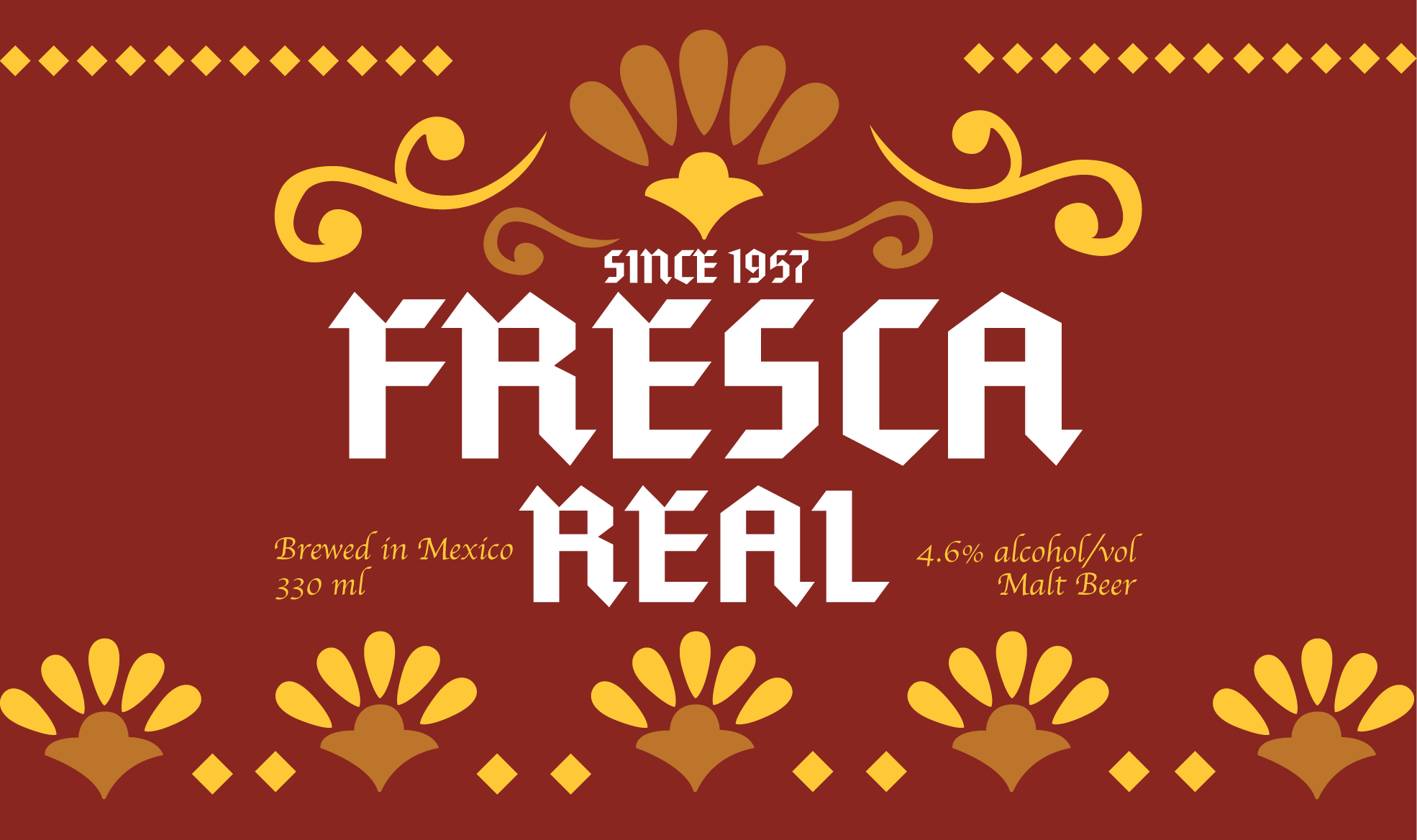
ROOTED IN MY FAMILY HERITAGE, FRESCA IS A TRIBUTE TO TRADITIONAL MEXICAN BEER, EMBODYING THE CORE VALUES OF FAMILY AND TRADITION. THE BRAND'S VISUAL IDENTITY IS ENRICHED WITH A CLASSICAL PATTERN REMINISCENT OF OLD MEXICAN tiles ADDING A TOUCH OF NOSTALGIA AND AUTHENTICITY TO ITS ESSENCE.
SCOPE
Packaging Design
Brand Identity
Sustainability
The idea was simple, incorporate a traditional Mexican pattern with familiar color into a new concept. In contrast to this last, I chose a cleaner and modern typography to contrast.
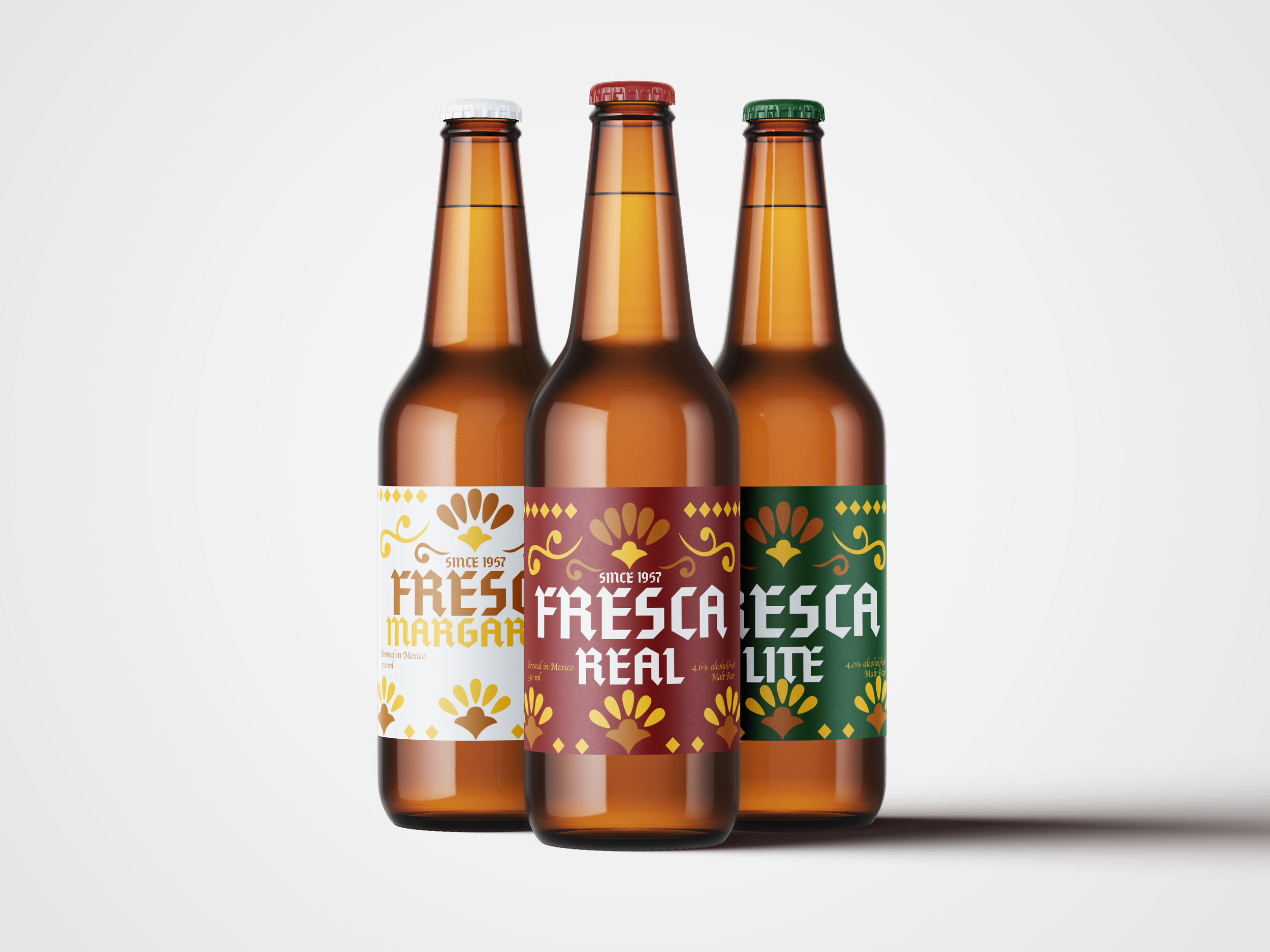
Having established the fundamentals of the packaging design, the next step was to create a cohesive and harmonious look. One crucial decision was determining the brand's primary color. After thoughtful deliberation, red was chosen for its simplicity and ability to complement the yellow pattern. Emphasizing the brand’s identity the product variation color became green and white. Colors that are easy to identify and add a touch of vibrancy without overshadowing the overall design, ensuring that the brand's identity is both distinct and appealing.


When it came to designing the variations of our main product, the biggest focus was on maintaining a sense of homogeneity throughout the brand. The main change we made was in the color palette. Initially, I faced a challenge with the title not fitting within the design. To address this, I reduced the font size slightly, ensuring that the title remained prominent while fitting seamlessly into the overall design.


Once the packaging design was done I brought it into some mockups to see it how it looks on physical and to start building up the image of the Brand. Although it is a beer with traditional roots I still wanted to make it feel modern.


